Design more, resize less, with Auto Layout


With Auto Layout buttons can resize with their text. Lists can rearrange themselves when items are moved around. And elements can be nested to create complex interfaces which respond to their content.
Building Auto Layout has been a fun but long journey for us. It’s something we’ve wanted to do for a while, but it took quite a few design iterations for it to feel right.
The challenge of bringing design and development together
At its heart, Figma is a design tool. It enables free-form exploration using core concepts like paths, layers, and groups. But this free-form nature can lead to lots of repetitive work. For example, a seemingly simple update to button text takes far too many steps—edit text, resize button, move adjacent button, and so on.
Meanwhile, production environments like HTML/CSS and SwiftUI are much better at describing the structure of a UI and the relationships between objects—which makes changing things like button copy far less painstaking. However, free-form design exploration, which might involve experimenting with layout changes swiftly as one might pick a new color from a color wheel, is near impossible in these environments.
So in building our Auto Layout feature, we wanted to marry these two worlds. How do we combine the ease of making edits in production while preserving the free-form nature of Figma?
Like many design challenges, the end result may look obvious in hindsight. After trying many different approaches, including some rather non-conventional ones, we felt the best way to marry the two worlds was to add a few core concepts from the CSS box model (specifically flexbox) directly into Figma. And by introducing Auto Layout as a property, you have the flexibility and power to apply Auto Layout to any frame, whether it’s in a component or not.
How Auto Layout works
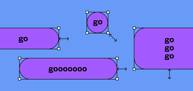
When you add Auto Layout to a frame, the items inside are stacked next to each other (either vertically or horizontally). The frame's size is then determined by the total size of the items within it. Auto Layout frames can have their own padding, fill, stroke and corner radius, so you can create buttons without adding additional layers.
This makes last minute requests like tweaking button copy from “Buy” to “Add to basket” a breeze. As you edit the text, the frame resizes automatically. And if you stack some buttons next to each other, they all move as you would expect. (Note: the one difference from the CSS model is that spacing between items is done at a container level. If you need to adjust the spacing between individual items, you will need to do a little bit of extra work.)
Generally speaking, Auto Layout is just pure genius. It’s so fast and will speed up our workflow so much; I just can’t wait to apply it to our design system.
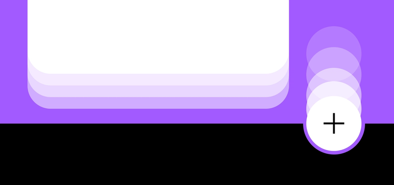
Beyond buttons, Auto Layout is particularly useful when creating designs with repeated UI elements, like lists and menus. Instead of countless clicks to move elements to their right spots, a simple drag and drop now does the trick.
It's awesome. I love the functionality it introduces and especially find the automatic reordering incredibly useful.
Additionally, if you have existing component libraries and design systems, you can now apply Auto Layout to each component by pressing Shift + A or from the Option menu.
Nesting your frames
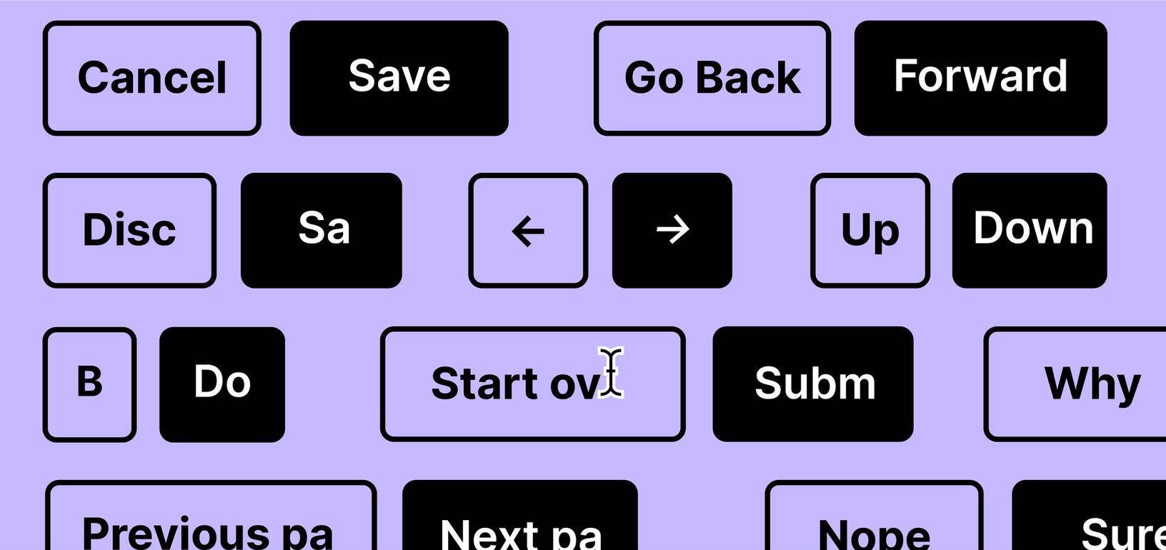
These individual Auto Layout elements can be combined into full interfaces by nesting Auto Layout frames in much the same way that div tags can be nested in HTML. Just as you would in a production environment, you can easily edit content and move things in or out of Auto Layout frames.
The feature does have a “safeguard”, which tries to prevent you from doing things that you probably don’t want to do anyways, like dragging a large image inside a button. But just in case that was your intent, you can override the safeguard by holding down the command key (ctrl on Windows).
Auto Layout is an absolute pain-remover. It solves so many issues and allows me to make way more generic components with basic controls, instead of new components for variations in content.
With Auto Layout, we hope that designing interfaces in Figma now feels a bit more like the way you build interfaces with code.
What’s next?
Just refresh your browser window to start using Auto Layout. For some help getting started, explore all that Auto Layout offers in this playground file, watch this video, or read the documentation.
By the way, this is just the beginning—we wanted to include so much more in our first release, but we also know you’ve all been waiting patiently to start using this.
We would love to learn about how you use Auto Layout and hear your feedback and feature requests. Please feel free to reach out to us @figma or @skuwamoto.